

Scott Barlow
March 14, 2020
Investors have learned that attempting to time the market is a pointless endeavour. But the unsettling spike in volatility has created the demand for an all-clear signal, an indication that something approaching normal market conditions has resumed.
The accompanying three charts are designed to accomplish this task. Each should provide valuable clues on when panic-selling episodes will subside and optimism will return, as well as increase the chances of finding investment bargains.
The top chart examines the relative performance of U.S. cyclical (economically sensitive) stocks compared with defensive, low-volatile sectors such as utilities and consumer staples. Since late 2019, flagging optimism about future economic and corporate profit growth has been apparent in a sharp decline in cyclical stock returns as investment assets poured into defensive names.
The blue line on the chart uses proprietary baskets of stocks designed by Goldman Sachs strategist David Kostin. The chart plots the trend of cyclical versus defensive stocks by dividing the value of Mr. Kostin’s basket of cyclical stocks by the value of the defensives basket. A rising blue line (which hasn’t happened for a while) indicates cyclical stocks outperforming defensives and investor optimism regarding future growth.
The trend since November has been clear. A falling line from that point to Feb. 18 showed investor preference for defensive stocks over companies dependent on global economic growth. The line then went into free-fall, plummeting as investors scrambled to de-risk their equity portfolios.
Whenever fears related to COVID-19 about the economic future subside, the pattern on this chart would likely reverse, providing a welcome sign of market optimism. Brave investors would begin taking advantage of inexpensively valued, beaten-down cyclical stocks in preparation for a recovery.
The middle chart compares U.S. 10-year bond yields with global manufacturing activity as measured by the JPMorgan Global Manufacturing PMI (purchasing managers index), a composite gauge. Over the past decade, the two lines have tracked reasonably closely – rising manufacturing activity and bond yields are both associated with inflation pressure.
The dotted line on the chart indicates the most recent yield on the 10-year bond, which is far below levels suggested by the last monthly PMI reading. This is probably justified, as the virus spreads into Italy, Iran and the United States and hampers the future economic outlook.
The health crisis appears to be fading, however, in China and South Korea, creating the possibility of future positive surprises in terms of manufacturing growth. Investors should pay attention to global PMI announcements from major economies because an upturn in the global PMI would be a very positive sign for markets.
The final chart also features an index developed at Goldman Sachs, this time from their chief economist, Jan Hatzius.
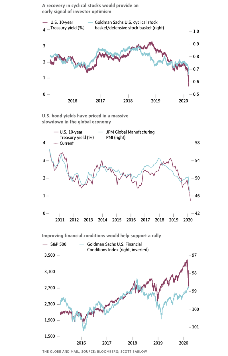
Mr. Hatzius developed the Goldman Sachs U.S. Financial Conditions Index to measure the effects of borrowing costs on the S&P 500. The index was constructed using corporate bond spreads for BBB-rated issues, Treasury yields, the trade-weighted U.S. dollar, and Federal Reserve policy rates to assess liquidity conditions. Here, the data are posted inversely to better show the close relationship between improving financial conditions and rising markets.
The financial conditions benchmark closely tracked equity returns from 2015 to mid-2018. Interestingly, financial conditions began deteriorating long before equity markets, from May 2018. Beginning in December 2018, equities began climbing far more rapidly than financial conditions. This created a divergence on the chart that was corrected only recently during the stock market decline.
Of the three charts presented, I trust this one least. However, continuing measures by global central banks to loosen monetary policy should help push the blue line higher and provide upward pressure on the S&P 500.
Given the sharp losses on Wednesday, it’s clearly too early for investors to wade into equity markets with much hope that things will stabilize in the coming days. One hopes the charts provided will help investors to discern when it’s safer to engage.
This Globe and Mail article was legally licensed by AdvisorStream.
© Copyright 2025 The Globe and Mail Inc. All rights reserved.